Monday, July 8, 2013

Just a Couple of Cards

Our 32nd Anniversary was coming up, and I used a couple of the Graphic 45 papers from Le Romantique to make my husband's card. Our wedding colors were peach and cream -  and so is the paper! Also, if you squint really hard, the bride vaguely looks like a younger version of me :) I used a paper punch to create the strip down the middle and the Spellbinders 'Lattice Rectangles'  and Classic Ovals Nestabilities as the frame and insert. The lopsided rose is one of the roses I talked about in the Civil War blog entry.


inside

Another South Carolina niece, Chelsea, just graduated from the University of Georgia, so I made her graduation card in Georgia's colors using the same 'Lattice Rectangles' Nestability, TPC papers,  adhesive die cuts. . . and another lopsided rose!!!


Sunday, July 7, 2013

Civil War Card and Variation

The real reason why I became interested in photo stamps (March 6, 2013 blog) is seeing a fabulous Civil War card on YouTube done by Kate Palmer. She gives quite detailed directions about her process and I became obsessed with owning the Civil War soldier stamp by Oxford Impressions. I also had to have the Cuttlebug Script embossing folder and a few other supplies before I could finally try to create my own version of Kate's card.

I began by stamping the soldier image using several colors of dye inks before deciding on one. I used DI to further "age" him. I colored a piece of manilla CS with Vintage Photo and Walnut Stain DI, embossed it with Script, then added more Walnut Stain DI to the raised images.


I gathered my embellishments to complete the card.


Recently I picked up the Tim Holtz Tattered Pinecone die on clearance because I had watched one of his videos showing how to use the die to make roses. There is a real learning curve to making them, and most of mine have come out quite lopsided. It begins with a spiral cut piece that you roll and fluff out. Easier said than done! They still don't compare to the real ones I got for my birthday (right).  At any rate I finally came up with several that actually resembled roses.


Another minor obsession I had was with a Tim Holtz tag featuring a little girl that really reminded me of my niece, Lindsay. It was used to demonstrate how to tint a black and white photo using Distress Ink. I thought he must have used a stamp because I saw other people using the same image in their projects. Imagine how exited I was to find that Tim shared the jpeg image of her so I quickly printed out several copies and began photo tinting. 


Finally the roses and little girl came together in a card that was inspired by my Civil War card.


Lindsay was just in from South Carolina so a made her a bookmark using her look-alike! A faux relative for my real relative!


Saturday, July 6, 2013

Fathers' Day

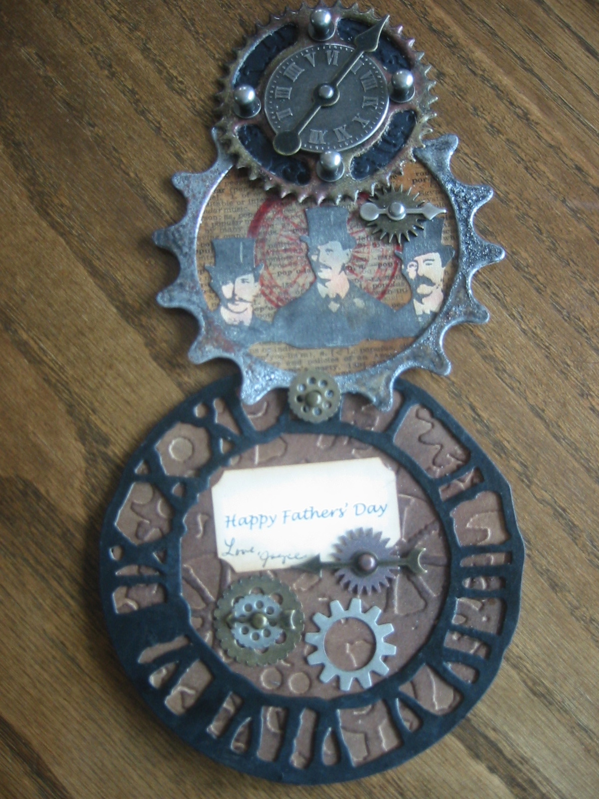
I have a backlog of photos from recent projects. The Fathers' Day cards I made for my husband and son  were so fun to make and I learned a lot of new techniques along the way!

The thing I love most about paper crafters is their willingness to share ideas and techniques by providing detailed instructions. Since imitation is the highest form of flattery, I used a telescoping card created by Shelly Hickox as a template for my cards. Although hers included some awesome metal wings that extended out to the sides, my attempt at making a set from grunge board and foil tape was a dismal failure!

There are three separate sections that are distinct when fully opened (last picture at the bottom), yet they fold to create this entirely unique visual.


The first section began life as a distressed circle using a dictionary page edged in vintage photo Distress Ink (aka DI), then coated with UTEE (ultra thick embossing enamel. I stamped the 3 gentlemen on cardstock (CS) which I colored with Distress Markers. The last addition is a die cut gear that was painted with black acrylic and embossed with silver embossing powder.


The largest section is a Weathered Clock die cut also painted with black acrylic and backed with kraft CS embossed using a gears embossing folder. I left the clock finish dull, but in retrospect I wish I had made it shiny using UTEE.


The final section was a dry embossed black CS circle that was topped with a weathered gear that had been painted in black and embossed in areas with gold embossing powder. I finished it with a clock face, game spinner, and Tim Holtz hitch fasteners. 


I also added assorted gears and pieces to the other two sections. When the sections were attached and extended, this was the finished product.


Thursday, June 6, 2013

June Tag of 2013


I was happy when I got the full set of Distress Markers for Christmas and, to be perfectly honest, I haven't had much luck using them as blendable water color. That's why Tim Holtz's June tag (12 tags of 2013 - June) posed a good challenge. I feel like I finally had success using them on my tag for the month of June.


First I stamped my pear on 130 lb. watercolor paper using Jet Black Archival Ink. I applied several colors using my markers and then blended them with a fine water brush. It took a couple of attempts to get satisfactory blending. This attempt wasn't the one I ended up using since I overdid the text.


When I was happy with another version, I applied Vintage Photo Distress Ink to the roughed and torn edges and blended the ink with the water brush.


Next I prepared the tag itself. The formula was a mixture of misted Distress Ink, Distress Paint, and Distress Stain. I was really happy with how it came out, so I am sure that I will use this combo on further projects. After it dried I covered it with stamped images.


After adhering the pear to the tag with Glossy Accents I felt like my tag still needed a little something. I have a stockpile of die cut, stamped, and colored tickets which seemed to do the trick.


The finishing touches were attaching a sprocket and spinner as well as stained crinkle ribbon. What a fun project to lighten a dreary June day!


Wednesday, June 5, 2013

Recent Cards

Things have been pretty busy here with our family in from Boston, so I haven't been spending much time crafting. Here are a few cards that I managed to finish just before they arrived.

The first is a congratulations card for a baby boy. I used my favorite "boy" colors and papers that I had originally purchased for a baby shower (also for a baby Nolan).


I love my daughter-in-law and wanted to make her a special card for her birthday. I was inspired by a similar card that I saw online that used "inches" stamps (each image is one square inch) and white embossing. I created the background color for the squares using Distress Stains, then stamped and embossed several full size collage stamps. To create my faux inches, I punched out sections of the images with a one-inch square punch. I added a stamped pear on the background paper of the card since it was rather bare without it. I added a tiny Eiffel Tower charm to the ribbon.


This last card is an anniversary card for my son and his wife. It was inspired by a box lid decoration I saw at candycreates.blogspot.com. Her work is outstanding, and the dragonfly she created using fantasy film is breathtaking! I had the Tim Holtz dragonfly stamp already and didn't want to invest in the film (a bit pricey and I didn't want a lengthy wait had I ordered it),  so I experimented with some iridescent cellophane. I stamped the image using black archival ink on several sheets of cellophane that I had sandwiched between sheets of parchment paper and fused with a warm iron. I also followed her directions for creating the frame using the fleur de lis rectangular Spellbinder dies. Please check out her completed project because it is awesome!


Monday, May 27, 2013

May Tag (and not the washing machine!)


I’ve been wanting to experiment more with my Distress Stains, so when I saw that Tim Holtz’s May tag used them for its background (tags of 2013), I figured now was the perfect time. I followed the detailed steps outlined on Tim's Blog to create my tag. The wings in the picture have primarily green hues in reality, but the camera flash made them appear quite purple :)


After applying pieces of Remnant Rubs and removing the excess with a sanding grip, I dragged my tag through pools of Distress Stains. Using Archival and Distress inks, I then stamped several images and inked the edges with Distress Inks. I wanted to try the rubs on other surfaces, so I painted a metal number and coated the inside of a corked vial with Distress Paint before applying the rubs to them. I think the rubs add an interesting dimension to the embellishments. The wings were created by stamping them with archival ink onto the top of several layers of iridescent Easter basket cellophane that I fused with a warm iron. They were layered over a cardstock base that had been inked with Distress,  highlighted with Stickles, and attached to the tag with Glossy Accents. I embossed metal foil tape with the Riveted Metal embossing folder to make the armored bodice. A patina muse token was attached to my stained and stamped crinkle ribbon to complete the tag.

My husband thinks my tag is somewhat strange, but I prefer to think it has Steampunk flair!


Materials used:
manila tag
Distress Stains (Broken China, Faded Jeans, Mustard Seed, Peeled Paint)
Numbers Remnant Rubs
Distress Inks (Broken China, Peeled Paint, Vintage Photo)
Stampers Anonymous (Regal Flourish, Haberdashery, Life’s Possibilities)
Picket Fence Distress Paint
Idea-ology (Metal Number, Corked Vial, Muse Token)
Stickles
Iridescent Easter basket cellophane
metal foil tape
Tim Holtz Sizzix Riveted Metal embossing folder
crinkle ribbon
Glossy Accents
sanding grip


Friday, May 24, 2013

I Spy Update

The I Spy quilt I made for my grandson was a huge hit. We weren't sure if he was old enough at 19 months to interact with it, but he began identifying new pictures daily. Here's a short clip of us putting him through his paces.